


Calculate your proptech boost!
Calculate your proptech boost!
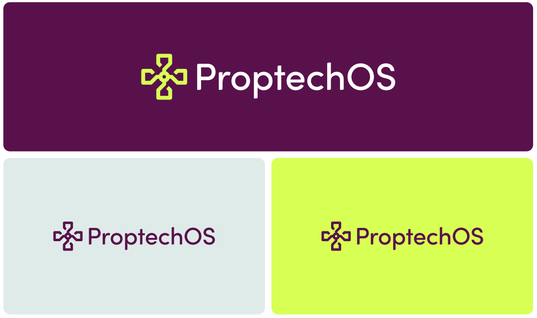
Primary version: Horizontal lockup (symbol + wordmark).
Clearspace: Maintain sufficient breathing room around the logo.
Placement: Top-left or bottom-right corners (standardized per format).
Do not: stretch, rotate, recolor, outline, or rearrange symbol and wordmark
Depending on the situation different color
variations of the logo can be used.
“colors”:
“primary”: “#59124C”,
“secondary”: “#D8FF54”,
“background”: “#E0EBE9”,
“text”: “#FFFFFF”
“typography”:
“fontPrimary”: “Avenir,
“fontWeights”: [400, 600, 700],
“headlineSize”: “48px”,
“bodySize”: “16px”
“cornerRadius”: “16px”,
“shadow”: “0px 4px 20px rgba(0,0,0,0.2)”
Font-family
Avenir is modern, clear, and balanced—suitable for both print and digital.
Rules:
Avoid all caps except in UI buttons or tags.
Maintain high contrast for readability.
Use brand colors for emphasis (e.g., Canary for keywords or highlights).